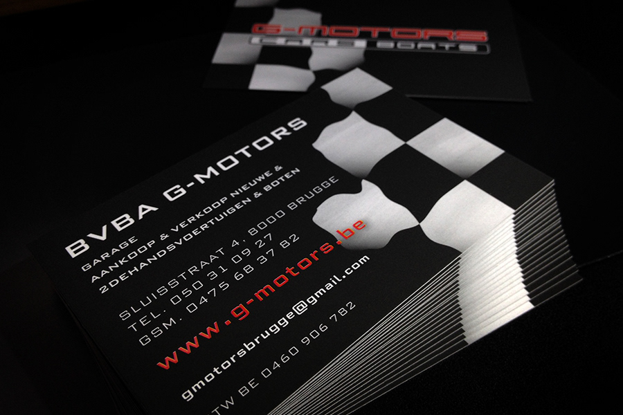
g-motors business card
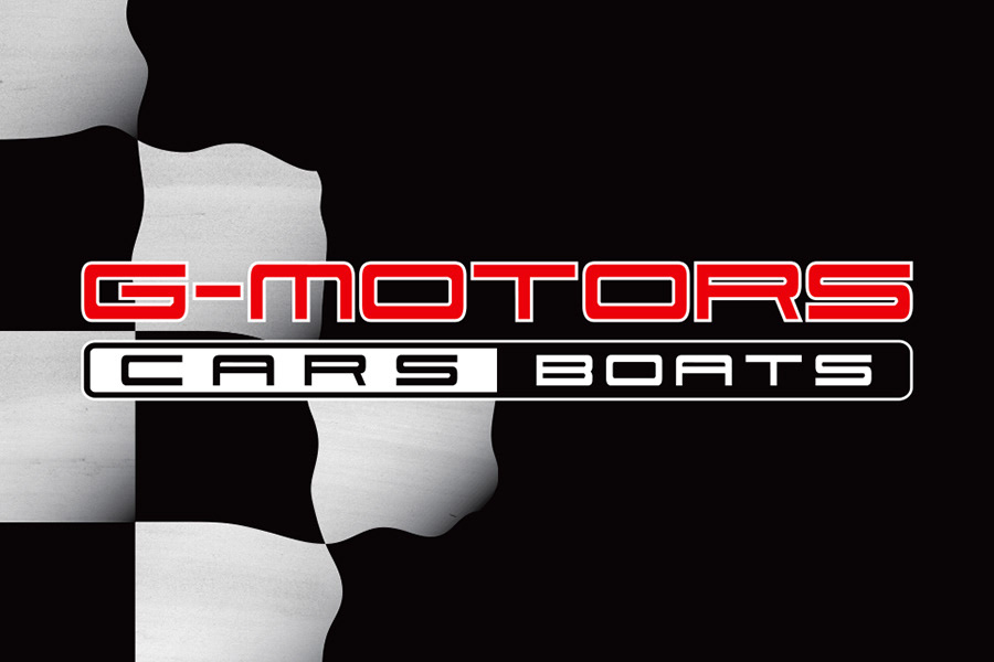
g-motors, another with an existing logo they were happy with, wanted a new & updated contact card. having just had their van done out in a black livery with large chequered flag graphic, they wanted something to match. rebuilding the old logo to tidy up the spacing & balance, then further tweaking it to highlight the business name in bright red (& the website url on the rear) the card was done in all black with white text & a custom made black & white chequered pattern to one third, then mirrored on the reverse. the card was finished in a soft touch laminate with the red g-motors name being highlighted with a UV spot, as was the url to the rear.
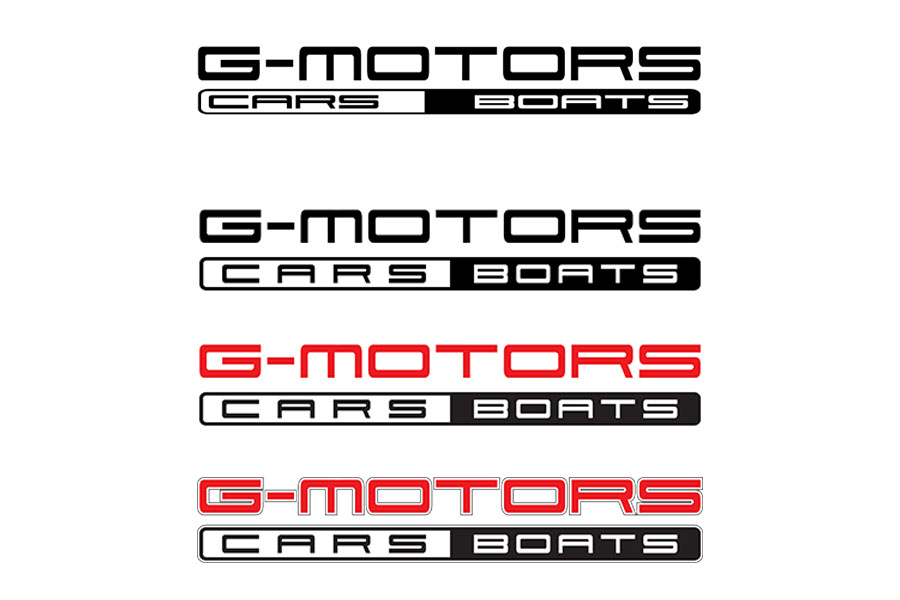
the sequence below also shows the original logo, its initial black & white tidy up, & then the tweak with the red finish. (also a version with a thin outline for screen application.)